Saturday, January 28, 2012

HOW DO WE STAY ON EARTH?


By Kevin Hodgson
Staff Writer


STORY SUMMARY
Gravity is one of those unseen things that can truly perplex young people. Maybe older people, too. Why don’t we just drift off into space? My sons have all asked me that question at one time or another. HOW DO WE STAY ON EARTH? (A Gravity Mystery) by writer Amy Hansen and illustrator Korey Scott is a non-fictional graphic book look at what gravity is and what it does.

Designed specifically for young readers, the text is based on science, not on story narrative. A little girl asks questions about the impact of gravity on her life. I loved that on the title page, there is a tiny little picture of Earth, with the message “You are here.” Cute. This is one of the First Graphics series from Capstone Press, and the back cover of the book nicely teaches the reader how to read a graphic novel (panels, word balloons, etc.).  HOW DO WE STAY ON EARTH? is a refreshing, colorful look at an important scientific topic.


ART REVIEW
The illustrations are colorful, engaging, and very kid-friendly in their humor and perspective. Scott has a nice touch to his drawings, and the images here nicely complement the tone of the text: serious, yet fun.


IN THE CLASSROOM
This whole series of science-based non-fiction graphic novels by Capstone would be a wonderful addition for any library in the lower elementary levels. The books are reader-friendly, and viewer-friendly, and yet, the content of science is not given short thrift. There’s learning to be had in these books, although most kids will probably not realize it because of the graphic novel element. Given that most states are in the midst of a shift to the Common Core curriculum that emphasizes more non-fictional, informational text, this series is worth a close look by educators.


MORE INFORMATION
Reading level: Ages 4-8
Format: Paperback
Pages: 24
Publisher: Capstone Press
ISBN-13: 978-1429671743

MY RECOMMENDATION
This graphic book, and the rest in the series, would be great additions to any lower elementary classroom ­­–– grades Kindergarten through two, perhaps.  If you are teaching basic science to young learners, it’s worth your time to check them out. I highly recommend HOW DO WE STAY ON EARTH? for your shelves.

I SEE THE PROMISED LAND


By Kevin Hodgson
Staff Writer


STORY SUMMARY
I SEE THE PROMISED LAND is a creative graphic novel mash-up that is put together like a comic, picture book, poetry and rap in a way that tells the life story of Martin Luther King Jr. from interesting angles. Creators Arthur Flowers (a blues musician and teacher), Manu Chitrakar (An Indian artist) and Guglielmo Rossi (a graphic designer) pull it off by fusing the well-know biography of King with the storytelling style of Africa and India, with hints of Hoodoo, too, as the Patua (Bengali) scroll-painting artwork transports the reader into an story circle of sorts of muses.

As the main story unfolds, the writers use a Griot chorus effect, as if a circle of listeners are adding their own rhythmic, rap-infused voice to the story of King, from his time growing up to his time leading a movement. Interspersed within the text are quotes and sections of speeches from King himself. This multitude of voices sometimes borders on cacophony, but mostly, it gives the text an aural characteristic for the reader. Even the text plays a part in the story. Where we learn King was shot, the page is completely black, except for four barren white text boxes. It’s a stark reminder of what was lost that day.


ART REVIEW
Many Chitrakar’s use of scroll painting for the art of this book is so different than we are used to, and so expressive in the colors and design, that the art truly does become a partner to the words in this book. A note in the book explains “the sequence of images in a Patua scroll – the matter in which images are read one after another – was more than halfway towards the structure of a modern graphic narrative.” There is a chalk-style effect to the images and they seem to be to be more at home in a picture book, perhaps, than a graphic novel. But that is the beauty of this book. It cannot be pigeonholed.


IN THE CLASSROOM
Given the wealth of resources about the life and times and words of Martin Luther King Jr., it would be hard to argue this is the definitive book for the classroom. But I SEE THE PROMISED LAND is unlike most of the other books and for students who are interested not only in King and his legacy, but also about the emergence of storytelling devices, this book may fit nicely in a larger collection. There is a helpful glossary of editorial notes at the end of the book, which goes into more details about such references as Reconstruction, the Black Power movement, and Operation Breadbasket.


MORE INFORMATION
Format: Hardcover
Pages: 142
Publisher: Tara Books
ISBN-13: 978-9380340043


MY RECOMMENDATION
I want to highly recommend this book, with some reservations. There are some images of hangings of blacks in the South and the emergence of the Ku Klux Klan as part of the experiences that formed King’s vision and the small references to Hoodoo religion, particularly at the start of the story, may be unsettling to students and staff who are wary of religion. I’d suggest this book be aimed at high school students more than middle school students, and that it not have a place in most elementary classrooms, given the content.

Saturday, January 14, 2012

CATHARINA EVANS JOINS TGC


Comics continue to change the literature landscape with more and more educators using the mode to engage students in literacy and scholarship. Catharina Evans –– Chair of Language Arts and Upper School English Teacher at the Saints Peter and Paul School in the U.S. Virgin Islands –– joins The Graphic Classroom team this month. 

Evans is an accomplished author, writing many articles for journals since 2003. She is a member of the National Council of Teachers of English (NCTE) and received accolades for her writing. Her debut review of ASTERIOS POLYP at TGC follows.

The staff at The Graphic Classroom welcome Evans to the team. We hope you will leave a comment welcoming her, too. 

ASTERIOS POLYP


By Catharina Evans
Staff Writer


STORY REVIEW
David Mazzucchelli’s first solo foray into graphic novels exquisitely blends a strong aesthetic voice and a complex, engaging story on the posturings of academia, the difficulties of intimacy, and the philosophy of design.

And to put it simply, one of the most visually provoking novels I’ve ever read.
Mazzucchelli’s main characters – protagonist Asterios Polyp (whose unusual last name was bequeathed to his father by a frustrated clerk at Ellis Island), his delicate wife Hana Sonnenscheie, and the ghost voice of his deceased twin brother Ignazio – interact in a kind of non-linear dream world which is both abstract and concrete.

Asterios, an architect and professor whose draftsmanship and design ideas are renowned, never builds any of his blueprints; he drifts along in a kind of cerebral prison, trapped in a golden cage of self-infatuation. 

Hana, the young and sensitive sculptor, falls for Asterios despite his nearly unbearable ego and little patience for Hanna’s quiet artistic genius. A love story for modern times.


ART REVIEW

The panel above illustrates the dissolution of Hana and Asterios’s relationship, and exemplifies how well Mazzucchelli unifies form and content: the dementedly-logical Asterios, depicted as a transparent combination of geometrical parts, exists in a world apart from Hanna’s penciled, pinkish, softly cross-hatched body.

Mazzucchelli’s aesthetic choices, from his palettes of warms and cools to panel placement and gutter width, invite rhetorical scrutiny. Most of the visual metaphors should not escape even the casual reader, though Mazzucchelli plays with a wide catalog of allusions.


IN THE CLASSROOM
ASTERIOS POLYP’s complex themes, allusions, and design concepts warrant placement in an advanced secondary or university classroom with some time to devote to both aesthetic and literary theory. However, for an ambitious high school teacher whose students exhibit familiarity with the basic vocabulary of comics, ASTERIOS POLYP may serve as a provocative medium in which to study visual rhetoric, art/color theory, as well as literary tropes like the tragic hero. A close look at Asterios’s flaccid bourgeois heroism, his inability to recognize his own flaws, and his decidedly detached approach to relationships may cultivate sophisticated discussion on gender and class. The book also acts as an introductory reader on the philosophy of design, which may take initiated students time to digest.


MY RECOMMENDATION
I highly recommend ASTERIOS POLYP for advanced high school and university classes whose curriculum centers on literature, art, design/architecture, and philosophy. The book contains some images appropriate only for mature readers, including nudity and bedroom scenes – however, they do not approach the realm of the vulgar.


OTHER INFORMATION
Author & Illustrator:  David Mazzuchelli
Publisher:  Pantheon Books
Genre: Fiction
Format:  Hardcover
Pages:  344
ISBN-13: 978-0307377326

Sunday, January 8, 2012

MARTIN LUTHER KING, JR. PRINTABLE WRITING PROMPT

The image above is a small version. For the large type-able and printable click here.

If you are looking for a new and interesting way to approach Martin Luther King, Jr. Day, Make Beliefs Comix posted a free MLK writing printable for teachers

Imagine you could tell the Rev. Martin Luther King, Jr. what he means to you and our country. What would you say to him?

The MLK graphic prompt is part of a new MakeBeliefsComix writing prompt feature called Digtal Write-Ables, which allows users to use their computer keyboard to write stories directly on the screen as they fill in the writing prompt. 

Students can then print out their writings. This graphic writing prompt makes a perfect springboard to writing a longer essay or story on the same subject. Don't forget the power of the Write-Ables for English Language Learners. 

HABIBI


By Chris Wilson
Editor-in-Geek


With the amount of critical acclaim, accolades and awards Craig Thompson’s Middle Eastern tome, HABIBI, has received, I can barely contain my awe and struggle to recommend this beautiful work highly enough. It is, by far, the greatest piece of comics literature I read this year, or last year, or the year before that –– maybe longer.

It is, in my mind, worthy of the ranks of MAUS and should be read, re-read, and prominently displayed in any literature lover’s library. I understand not all literati or academics accept comics as literature and I respect that opinion even if I disagree with it. However, even the most ardent traditionalists would be hard pressed to read HABIBI and not acknowledge the literary and artistic magnitude of this 672-page work.

The storytelling through text and art is magical. 

 Simply put: Get it; read it.

Now that is out of the way, let’s examine what you really want to know: How can HABIBI be used in the classroom? HABIBI is very sensual and sexual, making it extremely hard to use even on a high school level. It is better suited for more mature adults. I highly recommend it for the university level.


Dodola serves as both a prostitute and a concubine as well as enduring rape. 


Dodola's  adopted son, Zam, discovers new feelings and is confused by his newly budding sexuality.
The feelings of guilt plague him. 


HABIBI has a complex story line filled with mixed time lines. It offers deep literary and religious themes and metaphors exploring Islamic, Jewish and Christian faiths. The characters are beautiful and are still walking through my mind and heart. Its female-centric protagonist offers a wide feminist exploration. Issues of slavery, sensuality and sexuality, traditional versus modern views, race, culture, and poverty make it an excellent book in several classrooms and disciplines.

Thompson infuses culture, religion, metaphor, and story into every single inch of the book. From the endpaper, to the table of contents, from the frames around panels to the use of color (black or white) behind the panels to the iconography and calligraphy, Thompson’s artistic detail is exquisite. I cannot think of a graphic novel that compares artistically.

Thompson not only depicts calligraphy but uses the story to explain the meaning behind
the words and describes the story leading to the visual formation of the writing.

The iconography in the book is important. Each shape in the turtle has religious
 and metaphorical meaning that is explained throughout the work. 

Thompson uses many pieces of iconography to tell his story in many layers.


All of this makes HABIBI dominant in a textual and artistic sense perfect for many classrooms: literature, religion, feminist studies, sociology, psychology, sexuality, minority studies, art, calligraphy, and graphic design.

The panel layout is intuitive and even readers, who have never picked up a comic before, will adapt to the flow easily. However, I think students will need to be reminded of two things:

  1. Comics are designed to be read slowly. Don’t rush.
  2. Read the pictures. Much of the beauty and depth of HABIBI is hidden in her art.


Thompson uses splash pages to invoke an emotional level to the story.  

The depth of storytelling and the intertwining of text and art in HABIBI set it apart from other works. It would be exciting to explore this comic using many different literary lens and perspectives in a class. It would, of course, require a very accomplished instructor. 


OTHER INFORMATION
Author & Illustrator: Craig Thompson
Publisher: Pantheon

Format: Hardcover
Pages: 672
Color: Black and white
ISBN-13: 978-0-375-42414-4


CHRIS’ RECOMMENDATION:
Highly Recommended
This is a mature book recommended for college students and adults.

COMICS CREATION IN FIRST GRADE

By Chris Wilson
Editor-in-Geek

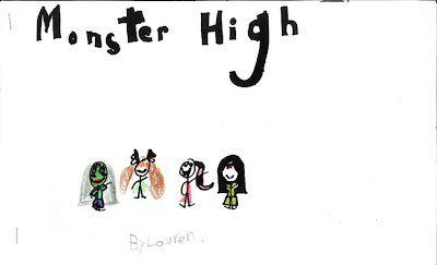
Students amaze me. They have talents that, as a specials teacher, I may never see or know. This week one of my 500 students, Lauren, came into my room carrying an 11-inch by 17-inch stapled document. She handed it to me with a smile. "I made this, Mr. Wilson."

Title Page of Lauren's comic, MONSTER HIGH.


Page two. Notice the sequence of the story and the panel layout.

I read it in front of her and immediately asked her permission to reprint this at TGC. (I also contacted her mother for permission to publish her art and her first name.) This comic is on par with many of the comics created by my third and fourth graders. She has well developed sequence and complex panel construction. I was also impressed with her choice to create stick figures yet color the characters as if they were shapes.

It is also significant that she chose a title page. I find many students –– even older students –– Just cram a title onto the story page like a narration box. Not Lauren. Her literary and artistic was thought out. I can only hope Lauren will continue the comic and also allow me to publish the next installments.

I think this comic illustrates how comics literacy –– reading and creating –– can be used to teach literacy skills from the front end (reader) and back end) creator) point of view.

Beautiful. She's only in first grade.